
I still remember the day when I first accessed internet in India. It was a hot Delhi summer day in August 1995 and I was in my dad’s lab. VSNL had rolled out internet first in government research labs I assume. My dad had brought me specially to office on saturday to show me this wonder. I fired up Netscape Navigator (many of you may remember it as the precursor to Mozilla’s web technology) and an IT assistant told me to type http://www.yahoo.com in the browser. Some lights blinked and approximately 10 seconds later some images appeared from a far off land with the help of some tired electrons that made this journey to my screen. I typed “Australlia” – yes with the typo in the search bar and half an hour later I knew a lot about Aborigines, Uluru, their art, culture, destinations to visit and such. I never had an encyclopedia at home and this was magic for my tiny brain. Soon, Indian government started making their web presence known and developed websites for their departments, ministries etc. They called them portals (not the one which Valve makes). It was all amazing. Such a giant leap for us.
Except for that fact that those portals with their ancient technologies have pretty much remained same till now. Duh.
To give you a glimpse, here is the website of Indian Meteorological Department (IMD). I urge you to go at http://imd.gov.in and explore the ancient wisdom of golden era engineers in their full glory.
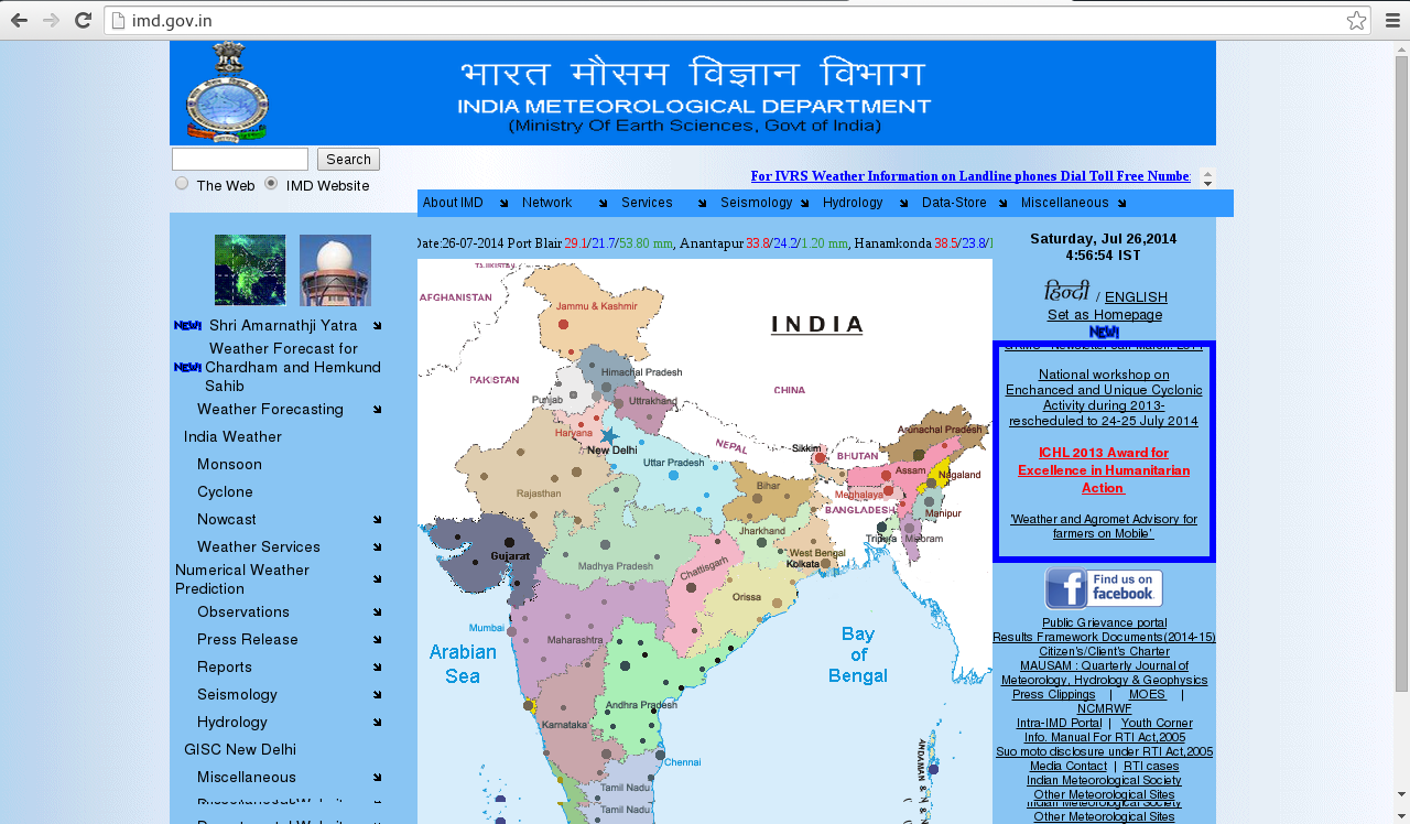
IMD website. Such beauty, much wow!
Here are some more screenshots of famous websites that people visit :

Indian Railways website – Best viewed on Internet Explorer 1024×768. Wow!

CBSE website – Teaching future generations HTML 1.0 tech

University of Mumbai – A flood of NEW

MTNL Delhi – We provide 4G services and online bill payment – but have the worst website on planet

Ministry of RT and Highways – I’ll let you know who built all this stuff
Oh yes, that is a marquee and those tiny “NEW” things are so fabulous. Its like web fashion from 1990s returning never changed since 1996. Wait don’t go. Here is a list of websites I urge you to try :
http://cbse.nic.in/welcome.htm
https://negp.gov.in/index.php <– security certificate expired
EDIT:
http://www.nift.ac.in/ <– This is a design school. I know, borderline technical, but still its a design school!
There are numerous others with suffixes as .gov.in or .ac.in represented by Government of India in some form or other but absolutely unusable by general public. I don’t think babus ever visit the websites or I wonder if someone actually ever cares about the websites from the sense of UX/UI perspective.
I have categorized some observations and here goes the actual rant..
The “New” GIF Syndrome
You may start crying that there is no uniformity in .gov.in domains or any government website. Well, you are wrong. Most of them suffer from this syndrome which make the UI puke-worthy. Its the “New” gif. A remnant from the dinosaur era, these small gifs were created by web enthusiasts when gif was cool (the first time). It was an amazing feature of that era (no jokes) but its (really)^infinity annoying in the age of HTML5 and CSS. All government websites have made it a point to annoy people while making announcements by putting these tiny devilish GIFs. People may see it as just a blinking “New”. But here is what it actually looks like to me :

The Marquee Dance
Remember the <marquee> tag? Oh this wonderful tool to have fun with in the 90s. There is no shortage of this piece of archaic technology in these websites too. I think its the worst tag ever designed. I don’t know how others see it, but its just so annoying to wait for 2 minutes just for the relevant announcement to scroll like a snail on the screen and then trying to catch it using the mouse as if a cat is chasing a mouse.
Those “Notice” PDF Links
Many times on such websites, from time to time, some links right from the home page (which for example says “Bus Schedule”) will point you to a shabbily scanned 10 page incomprehensible document of a schedule with all the official signatures, and rubber stamps still intact. There would even be a chai stain or staple-pin mark somewhere or other if looked closely. I mean seriously guys? Make a schedule in Excel -> print it -> get it approved by 3 people -> page crumbles -> scan it -> convert to pdf using a shitty free PDF converter -> put it up as hyperlink on a govt website?? Even Jackie Chan’s logic would get screwed here. This is the worst form of information delivery. But at least its better than no information. When will the process get streamlined?
The Babu photu effect
“Madame, ismyle pleej!“. Many websites also have images of ministers right in the headers. Refer to the images above. This is not so common, but not so uncommon too. Remember the fiasco over @PMOIndia twitter handle when it was gonna be archived? Well, ministers will not take any chance here.
The tiny multi-coloured serif fonts
This is another annoying thing. Minuscule serif fonts all scattered over with their red green and blue colors – creating an information overload. Along with the marquee and the NEW GIF (my soul cracks once each time I imagine that) the effect is amplified 100 times. The person just gets lost. Into the bottom of the ocean. Sometimes I feel they design the websites like this knowingly – just to hide some incompetency they may have.
The low-res myopic vision
So many aspiring photographers with their flashy DSLRs on Facebook and not a single one clicking professional photos for Government websites? It seems they have to do their best with 340×480 images, blow them up and plaster on their websites 😦 Look at the glory of those pixels. Such beauty in pixelated images. (/me weeps again). And those horrible logos. Probably done in MS paint 20 years ago and stretched using <img> tag all these years again and again and again with wrong aspect ratio. Even if there is a logo change, its still in MS Paint I think. Such dedication you see.
Unquestionably, India is a global IT leader. They do amazing things. There is no dearth of good web engineers and designers for sure. The websites of TCS, Wipro, Infosys are all well done. All private entities have wonderful websites – Airtel, Tata, Birla, ICICI, Even PSUs like ONGC etc. BUT WHY NOT GOVT WEBSITES? Why not even websites of central or regional academic institutions? Just look at website of any government engineering college in any state. The things which general public needs most is in the worst state. People would argue that internet penetration is not good and hardy anyone uses it. Well, you are wrong folks. Don’t judge a book by its cover. Just see the amount of bookings done on IRCTC website each day. The indigeneous technology which CRIS has put up is commendable. Thousands of students use CBSE websites to search for study material and see results. Remarkable too, is the work done by organizations such as ISRO – they may have not launched a beautiful and informative website but they have launched a spacecraft to Mars 🙂 If you dig deeper in the IMD website, there are hourly images from Kalpana satellite and quite accurate doppler radar maps of weater in major cities. Just that nobody knows and ever uses it because its hidden beneath layers of obscurity and bad UI. This is the department that prevented a recent catastrophe in AP. We have engineers who can do this : http://railradar.railyatri.in/ A flightradar like app for Indian Railways (I don’t think many railways in the world – except DB provide such APIs to get moderately accurate running info on the web). But we don’t have engineers to design an efficient Indian Railways website? There are 3 separate websites related to Indian Railways – all confusing. I cry in the nights silently seeing these websites, tears rolling while booking railway tickets, looking at election results, so on and so forth. The pain is unbearable. Even if I want to help, maybe I won’t be allowed to as I am not in a sarkari job as the awesome guys there. They are very good and highly apt – but in UI/UX technologies of the 90s i think.
All this does not absolve the government from the leniency and giving arguably the worst UX experience provided on the web. There is no uniformity in the government websites and no way to actually get the head and tail of anything that goes inside. National Informatics Center (NIC) which I presume handles these major websites has at least redone its website (http://www.nic.in) so its not an eyesore anymore. (Thanks a lot guys) Same is the case of recently launched Mygov website (http://mygov.nic.in/), http://www.data.gov.in and Department of Electronics and IT website. I think they even tried to organize a hackathon! Good job. I just hope all the Govt websites start getting a facelift like these ones soon. I don’t know if its gonna be effective or not.
I showed the miserable websites to my friends here and we all enjoyed a few laughs. Then I saw beautiful govt websites of many countries. How can I explain to them that there is a high chance that some of these websites may have been designed by Indians but the Indian Government itself is incompetent to utilize their own engineers to give better service to its citizens. How and what kind of people do they hire in institutions like NIC? Is an entrance exam enough to show aptitude in design and development? Is there some in house training being delivered to engineers to bring them up to date? Foreign investors visit these websites for sure to see infrastructure support. Imagine what they will think when the visit Ministry of Highways website and see the badly “Photoshopped” fake looking images. Sigh.
Lastly, an open request to some randomly web surfing government IT officials and policy makers who may have reached here. Contact me folks, I will do designs for free. Trust me. For FREE! I will take out time from my research, sit in a foreign land and do it for free, just for you India – only if you keep your egos aside and invite the open world to help you. Start a major UX/UI redesign project for web and open source it. You will be surprised how many talented young minds will help you out.
Over and out. Spread the word.
EDIT :
I’ll just record some exceptions to the above here :
http://gectcr.ac.in/ <– This should be the example for all Govt academic institutions. They took the initiative. Kudos!
Government has a web design policy and guidelines doc. Saved for reading later : http://web.guidelines.gov.in/

Even the websites created by the most famous of Indian tech companies like TCS and Infosys look shit. The whole Indian technological scene is stuck in 90s and there is no sign of change. There is no importance given to privacy. All college students are give subsequent roll number and anyone could look up anyone’s results. It is just preposterous.
I think their own websites are borderline bearable. However the ones they build, like the Passport Seva Kendra by TCS, IMO was below industry standard. But I personally know awesome designers from India, working for startups and the likes, whose websites are amazing.
This also reminds me of Chief Electoral Officer, Delhi website. Here is some personal info – complete with Voter ID card info, address, family info of people – right from a Google search : http://ceodelhi.gov.in/WriteReadData/AssemblyConstituency/AC03/A0030070.pdf
This is the level of data privacy. *claps*
I think private sector is not untouched from issues you raise.
Take for example, most US banking websites directly lead you to your account statement. There is no concept of mini-statement and detailed statement. You could access data through Mint.com. Whereas if you check out ICICI bank website, you have to hover over Login and precisely navigate to Personal section. It will create another window which will play hard with password managers. And then interface will have link to the whole banking industry starting from mutual funds to PPF account details to credit card. Very well knowing that users doesn’t have any of that. Then you have to click through several links to get to your bank account details.
On the topic of banking system, the thing that annoys me most is that neither government nor private sector has made it possible to easily do online transactions. I am sure this is a familiar screen [Imgur](http://i.imgur.com/5jlX6L1.png)
Btw, I also realized that anyone can use python’s urllib2 module to get hundreds of MBs of personal info of all residents in most of constituencies in Delhi from the http://ceodelhi.gov.in website by just iterating over constituency names and sheet names. Such high end security. I am so happy I did not register for Aadhar card. Nor will I do it now, seeing such lax security first hand. And then they cry for fake documents and illegal immigration. Duh.
I personally think that banking sites in India are better in terms of security. In banking, at least in Canada, concept of SMS updates on transactions and 2 factor authentication are unheard of in generic cases. I can’t access my ICICI account from here and this is a good sign. I even tried to call them and get access but they refused and told me they will send details only on my registered mobile number in India. Awesome++. Yes, I agree that usability wise (such as two statements, extra clicks to manage different account sections etc) its very cumbersome and sometimes useless but I would still tolerate this for a more secure account. Here seriously, they don’t generally have “Verified by Visa” (Visa) or 3D Secure Code (MasterCard) technologies for all transactions yet. A friend of mine got phished recently and somebody booked a ticket to Ghana or somewhere using his credit card. Thats how secure things are.
Maybe in the image you sent, radio buttons can be replaced by a drop-down list with intelligent completion as you type for better UX.
I am not sure how necessary that is. Online transactions are at heart of western society. They are completely insured too. You will never be penalized for transactions that you didn’t make.
“Verified by Visa” or sms are nice for people who don’t have 24×7 access to internet and all their web accounts have password effectively equal to either their first name or 123456.
I would tolerate any of these as long as their is some familiarity among them. If all are doing OTP, I am fine with it. But they all use their own protocols.
Big problem is lack of a central identity. If I have a photocopy of any of your identities I could effectively get a SIM card on your name and destroy your life.
Its not all bad – yes agreed 95% are really yucky! But some are coming up to the age of HTML5 and google-isque designs – http://mygov.nic.in/index , http://pmindia.nic.in/news.php
PMIndia/mygov thing is publicity material. Another political stunt to derail the discussion from real issues, from real usable websites that matter to the common man – Rail, Weather, Telecom etc. I just hope that new government is shaking up NIC from within. It would have been really good if there was a national level discussion on providing better websites which a lot of people actually use. I mean the irony is really very stark here. IT leaders, but can’t even make their own websites. If govt is not able to do so then at least hire some big private names to design – not you local script kiddies and Frontpage designers running an office from a street corner. I am sure if you see the orders through RTI, there would be huge amounts sanctioned for a web infra that is then delivered in such pathetic form. Its the easiest way to “eat” huge sums through backdoor without public ever staging a protest in return. Because we are used to the f**king NEW gifs and the devilish marquees now! Its like being in DPRK – but on the web.